CASE STUDY
An Accessibility & Usability Website Evaluation.
Basic Accessibility review · Usability · Design Recommendations

About EcoCounts Group
A UK-based climate action charity whose primary goal is to motivate environmentally conscious individuals to track their carbon footprint. They wanted to explore incorporating accessibility into their website and PDFs.

Website Accessibility and Usability Evaluator using a framework and manual accessibility tools.
→
Consultation to identify organizational goals
→
Accessibility and usability evaluation
→
Top recommendations with examples
→
An accessibility statement
Tools Used

Figma
Canva
Adobe Suite

Wave
Google Suite

Slack
The Evaluation
I focused on changes that balanced user impact, organizational goals, and feasibility. Findings were prioritized by their effect on readability, navigation, and task completion, then translated into practical design recommendations.
I manually reviewed the website compared to current WCAG guidelines and used the online WAVE tool to identify potential accessibility issues.
01
Identify
WAVE + manual review to surface potential barriers
02
Investigate
Connect findings to accessibility & usability principles
03
Prioritize
Consider user impact, organizational goals & feasibility
04
Recommend
Propose achievable design changes with clear rationale
Low color contrast can make text harder to read for people with low vision or color-vision differences.

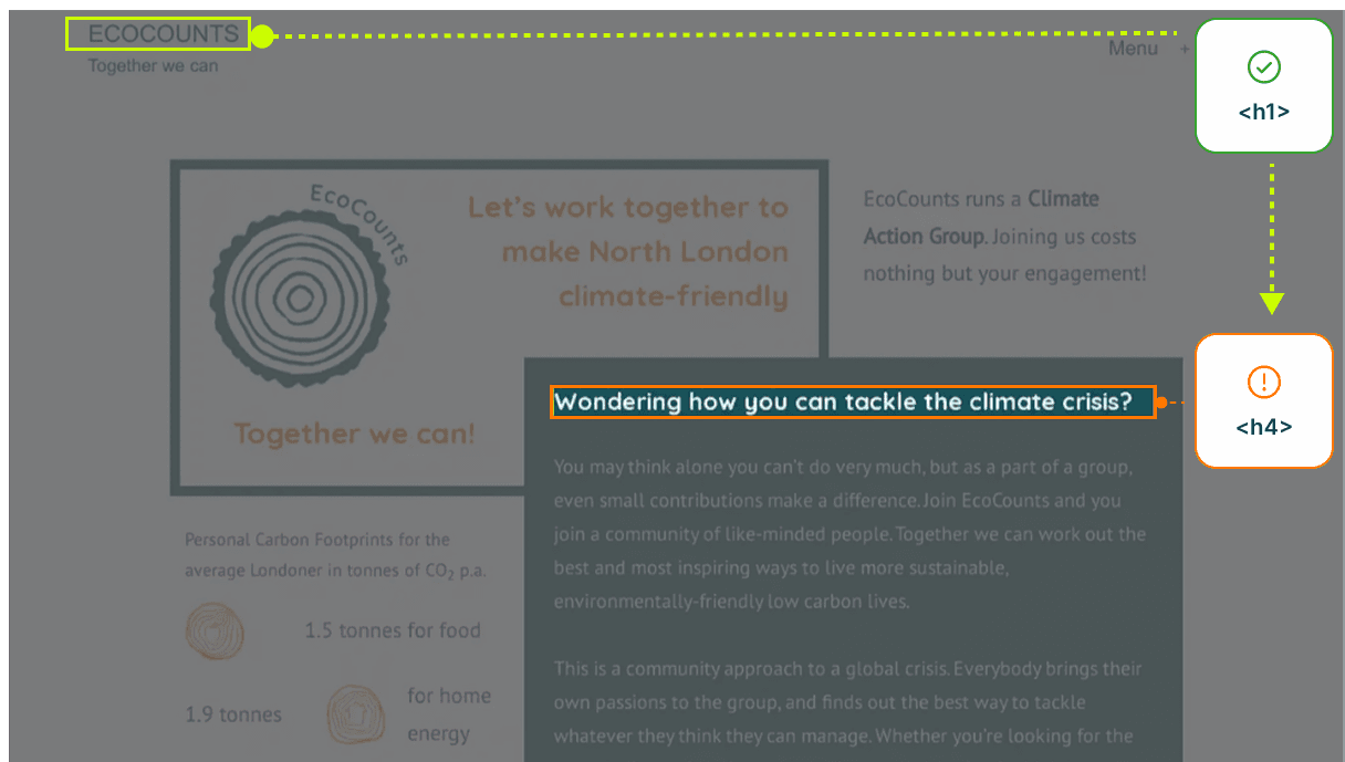
EXAMPLE 02 - Semantic Structure
Skipped Heading Levels
Skipped heading levels can make it harder for screen reader users to understand and navigate the page structure.
EXAMPLE 03 - Applying the Findings
Improve Form Accessibility & Usability
The suggested redesign uses clearer structure, persistent error feedback, and stronger contrast to make the form easier to use.
Before

Suggested Redesign


The Outcome
The recommendations gave EcoCounts a practical starting point for improving accessibility without overwhelming its volunteer team. Several recommendations were implemented, and the organization incorporated the accessibility statement into its website.
This project strengthened my understanding of how accessibility, organizational needs, and usability intersect. It also reinforced the value of considering accessibility from the beginning of the design process, when improvements are easier to implement.
